
The Challenge
Navesink Wellness Center is a boutique mental health clinic based in New Jersey. It is a unique practice that has managed to preserve the boutique experience, even as it scaled to four locations and 20+ clinicians. The founder, a licensed clinical social worker, created a proprietary wellness app called Mindstream™ so clients can stay connected to their therapists between sessions. She also developed a clinical method her entire is team trained in and makes sure a real person answers the phone every single time it rings. Everything at Navesink is designed around one belief: you don't become a number here.
Despite their unique operating principles, the website made it look like every other large mental health group in New Jersey. It felt sterile and corporate, with long paragraphs of clinical language. The founder was terrified prospective clients would see a big practice and assume they'd be just another patient in the system. She feared they'd leave and book with a smaller practice that felt more intimate, even though Navesink actually offered a level of intimacy few competitors could match. The site was creating a perception gap that needed to be addressed. Beyond that, the website was an operational bottleneck. Every month the gap between what the practice needed and what the website could support got wider, and it was costing them.
What we did
Our goal was to close the gap between how Navesink Wellness Center actually operates and how they appear online. They also needed a platform that could support a multi-location therapy practice with a proprietary app, a growing clinical team, and an expanding service menu. The project started with a comprehensive strategy overhaul. We mapped every page, every user flow, and considered factors from the previous site that were creating friction. The entire site was then completely redesigned from a blank page and custom built in Webflow with a CMS designed specifically for how this practice operates.
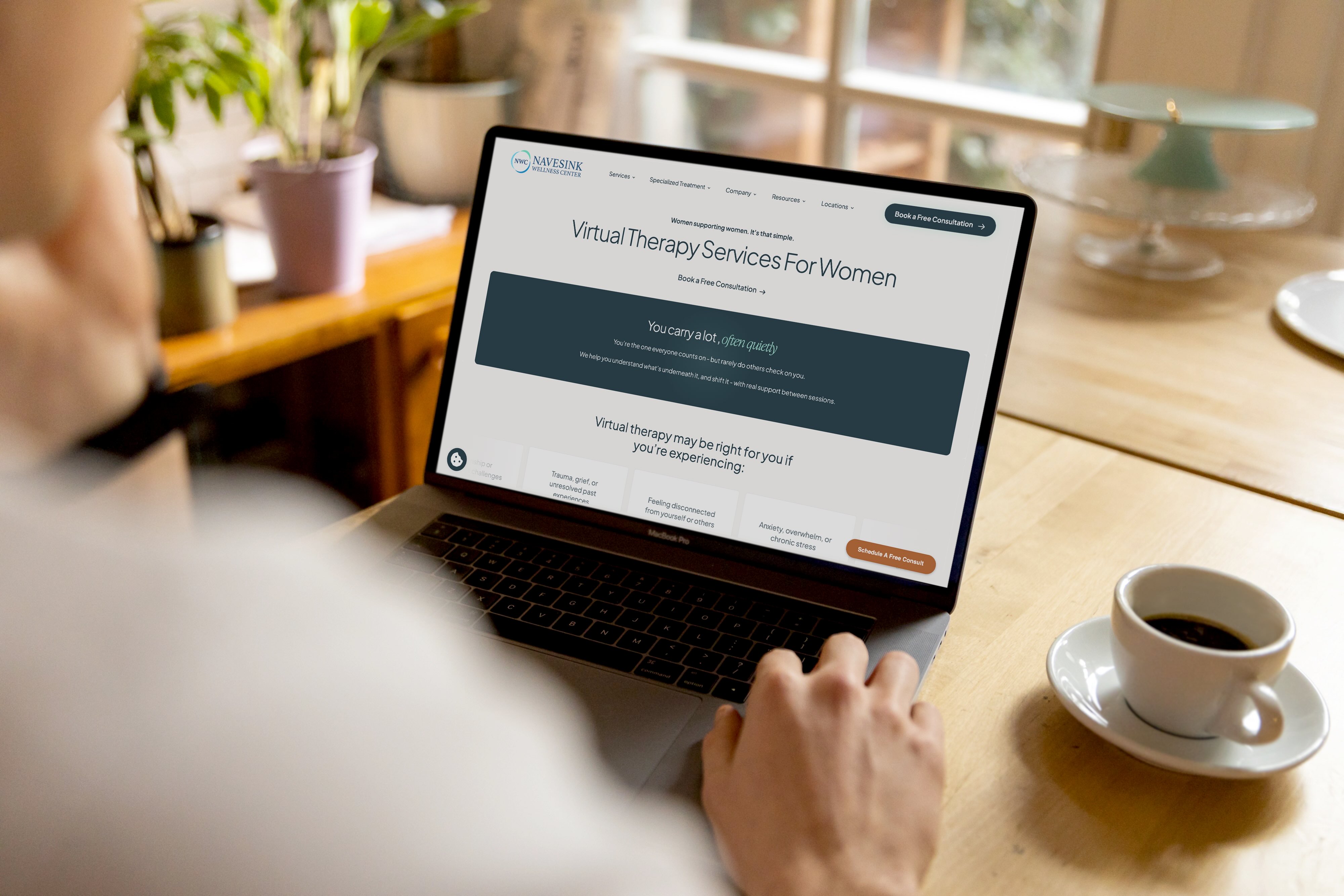
Copy across the entire site was rewritten to match the brand voice established in discovery. Language like "We're not here to fix you—we're here to help you find what you already have within you" replaced the clinical benefit statements and generic language that dominated the old site. The new homepage opens with "Continuous Care, Constant Connection," language inspired directly by the practice's operating philosophy, and moves visitors through a clear journey toward finding information and taking action without overwhelming them with large walls of text. The visual design focused on creating a safe space that is easy to navigate and presenting information in a structure that isn't intimidating. Our goal was to guide users to the right information, rather than diagnosing them on the spot or assuming they knew exactly what service they needed.

Looking Ahead
[who are we?]
More from our creative team


Get a hold of us anytime, anywhere
